disqus-universe
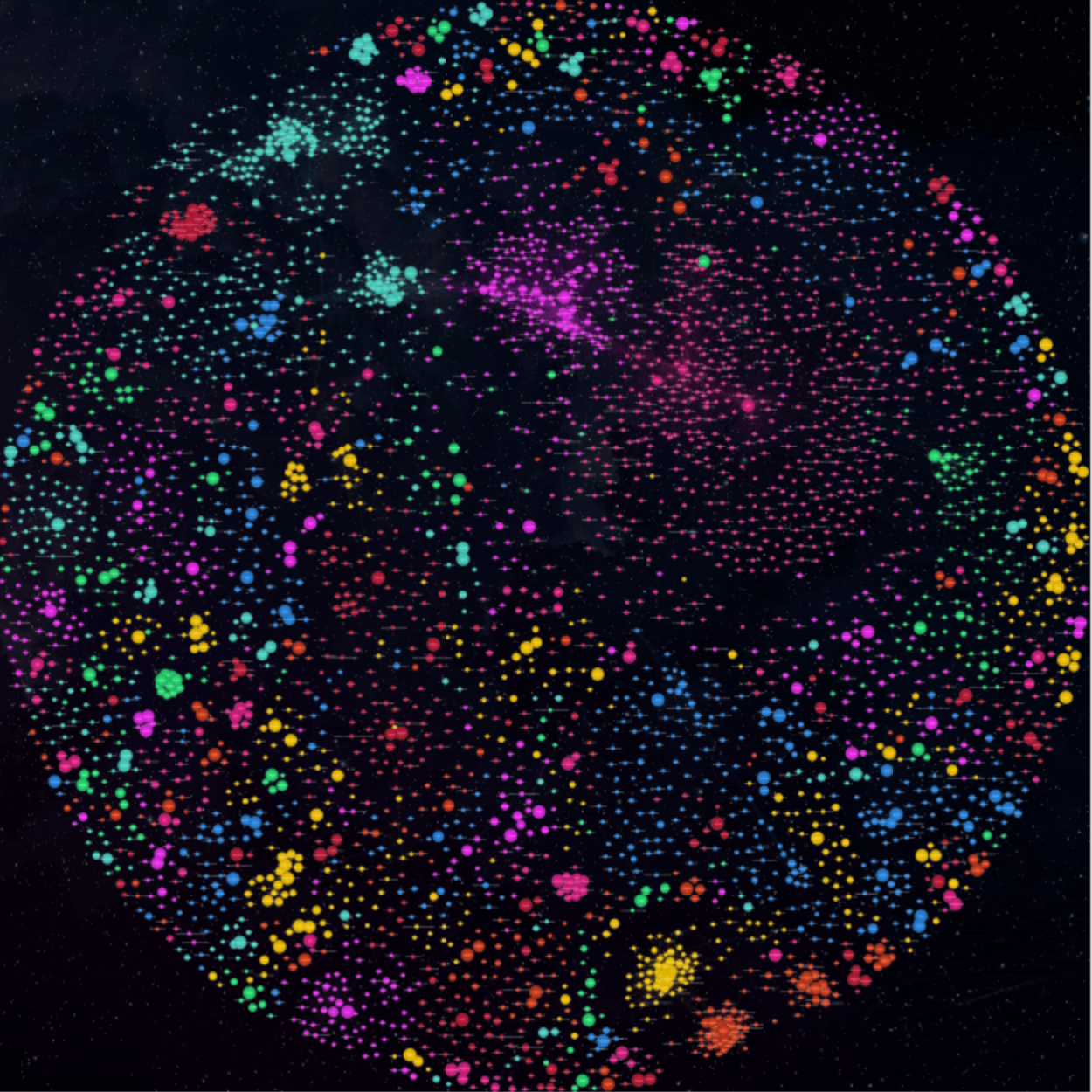
A project for Disqus Hack Week, Winter '17/'18. A coworker and I built a graph of Disqus sites, drawing an edge between any two that shared enough commenters, using only data available through Disqus' public APIs.
We ran the graph through igraph for layout, cleaned up the resulting SVG, and then fed it to Maptiler - which turned the whole thing into a slippy map you can pan and zoom like any other, except the continents are communities and the distance between them is how much of an audience they have in common.
Python, igraph, SVG, MaptilerSource available on Github.